My Cosmo Internship: Lessons Learned
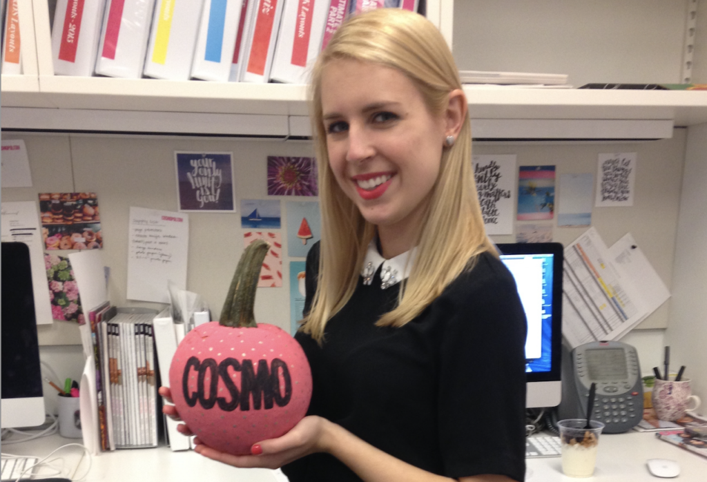
I used to be a Cosmo intern, in 2016 specifically.
Yes, it was EXACTLY like the TV series The Bold Type.
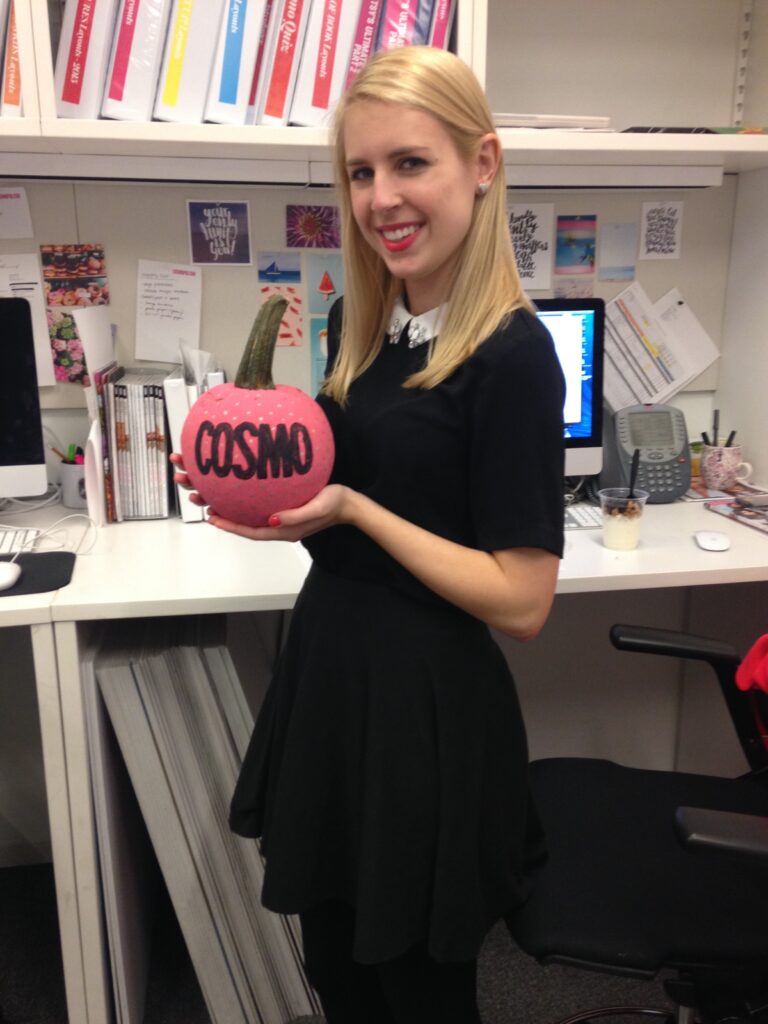
The art department structure looked like this: one creative director (who I rarely saw/spoke to), two art directors (who assigned me tasks), one designer (my boss), and then me: the art intern. This is what my desk setup looked like!
These were my responsibilities:
- Design FOB (front of book) and BOB (back of book) pages.
- Cut out images in Photoshop for other people’s layouts.
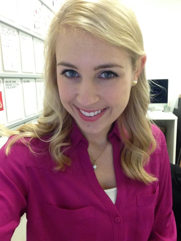
- Print out pages and update “the wall” (the whole magazine pinned up on a wall) with up-to-date layouts. (See photo below to see me sneaking a pic of “the wall”).
- Get everyone coffee. And bagels. One time I got Joanna Coles, editor-in-chief at the time, her salad from a nearby lunch spot.
I learned a lot about design during my internship, and I wanted to share those lessons with you guys!
- Readers read magazine pages from the top left to the bottom right, in a “Z” shape. (This also applies to web design!)
- Pair bolder, high-contrast fonts (high variation between thick and thin strokes) with smaller, monoweight fonts (no contrast between thick and thin strokes).
- Play with scale in typography for a dramatic look. For example, a large, bold headline with a tiny subhead (or eyebrow, a subhead above a headline!) with lots of tracking, or letter spacing.
- When overlapping multiple elements in a design, make them overlap enough to look intentional, otherwise, it will look like you made a design mistake.
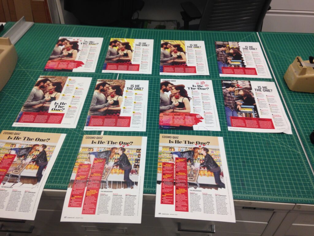
- Art directors need to see LOTS of options. At one point, I made 9 different versions of a single page. This might be where my love of the one concept method comes from!
- Adding texture to your design makes it “jump” off an otherwise flat page (this is true for websites as well!) I often would use scans of drawings made with lipsticks from the beauty closet (a real place), paints, torn papers, and glitter to add depth.
- The fight between copy and design would most always be won by the copy department (we’d always ask for cuts to the articles for space but the editors would deny us!) This is why I love short, succinct copy so much.