Creating a Typography System For Your Website
So first what is a Typography System? It’s a collection of font families and weights that explores building hierarchy using size, color, and line-height. It also establishes body text, headings, and responsiveness (Nathan Curtis, Medium, 2019), all important to a website right?

One question I get asked by clients often is, “Do I need to use the same font from my logo in my website?” The answer is no! Often that comes with the next question: “Ok, then which ones DO I use?”
Typography on your website is an incredibly important tool to get your website visitors to not only stay on your site, but keep reading more about you and your impactful products and services.
Let’s do this list style, with common assumptions I’ve seen around creating typography systems for websites. Let’s bust some font myths!
Assumption #1: I have to use my main logo font for my main headline font
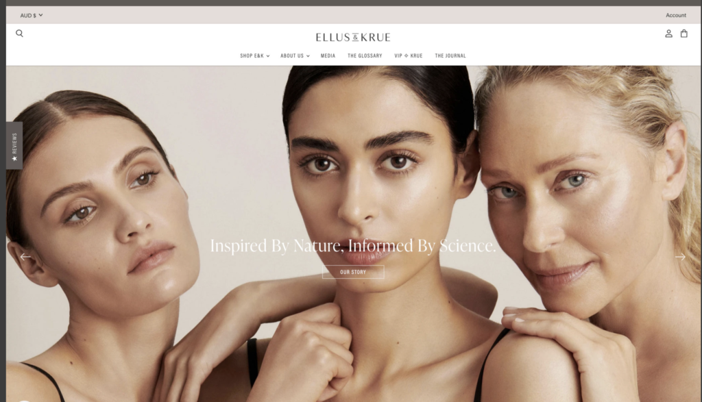
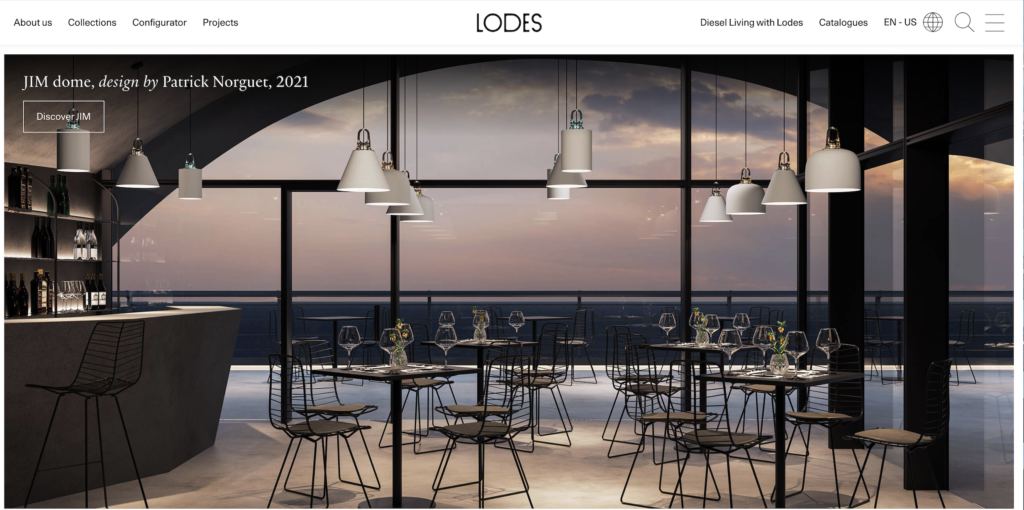
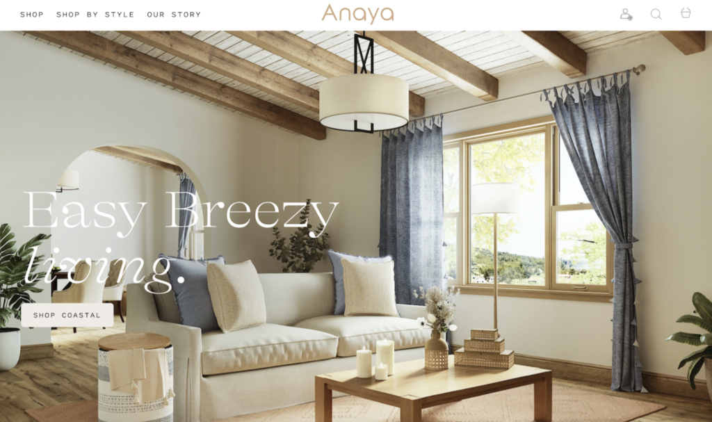
Nope! These actually don’t have to be the same. I’ve been a fan recently of using a serif typeface for the main headline font in a website if the main logo has a sans serif typeface and vice versa. But you don’t have to mix and match! Keeping it all the same (all sans serif or all serif) looks nice too. Here is an example of both of these in action:
Assumption #2: Handwritten headline fonts make my website feel organic and down-to-earth.
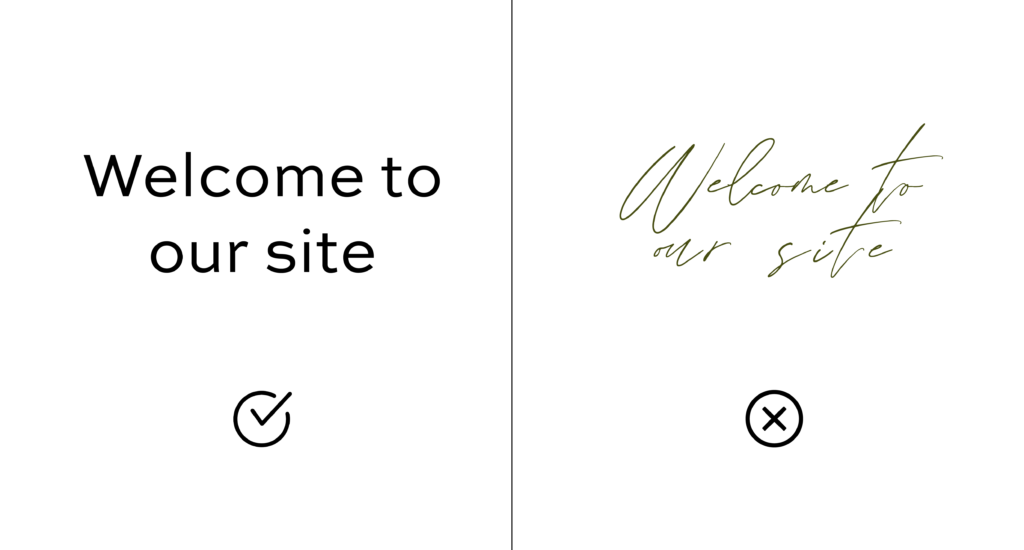
I recommend only using script fonts as accents on websites. Readability is KEY! You never know who could be visiting your site, what their vision is like, how old they are, or what screen they are using. Difficult typefaces to read can often be thin lines that are calligraphic, handwritten, or even sometimes ones where the letters, words, or lines are too close together (called leading and kerning).
Pick a font that is easy to read even at smaller sizes and one that has good spacing and contrast. If your site background has a unique color, like cream, and your typeface is a dark green, you may not want to go with a really thin typeface. Make sure you are keeping contrast in mind! Also think with mobile in mind first, 90% of the global internet population use a mobile device to go online (Statista, 2021). So let’s make sure that 90% can read the important information on your site!
Assumption #3: There’s too many fonts I like! I can use as many as I want as long as they all look good next to each other, right?
There are so many wonderful typefaces out there, but that doesn’t mean every one you like is right for your brand. Hopefully, your brand designer carefully chose a typeface that is perfect for your brand personality and target audience! My suggestion would be to not use more than three typefaces. Even just two with different weights or letter spacing settings should be able to achieve an overall cohesive and professional look. This also helps with site speed, a huge factor in getting your site ranked highly on search engines like Google.
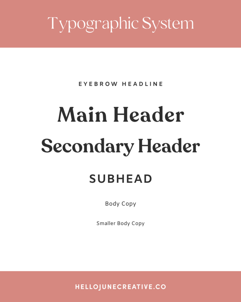
So now that we have cleared up some of those common assumptions, what typefaces do you actually need to start working on your site? Below I have a typographic system I use in my branding process to give the client all the possible typefaces they may need for their website and any collateral items. It’s important to have variety while still having harmony between your typefaces so they compliment one another, not compete.
Now that you have a better idea of how you could set your Typography System up, and some mistakes to avoid, I hope you can go have fun and get creative with your brand typefaces!