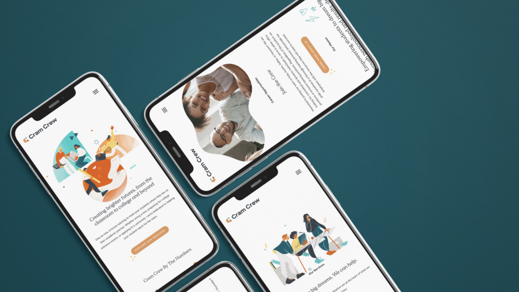
The Importance of Designing for Mobile

In today’s digital age, mobile devices have become integral to help us with our day-to-day tasks. We use our phones for everything from checking emails and scrolling on TikTok to online shopping and entertainment, and often times we don’t even touch our laptop unless we’re actively working. That’s why it has become increasingly important to design websites that are optimized for mobile. And when it comes to mobile web design, what better platform to utilize than Showit?
Why is mobile design so important?
There are over 3.8 billion mobile users worldwide, meaning that mobile devices have surpassed desktop computers as the primary way people use the internet. 54% of all internet use is exclusively mobile only! (via Kinsta) If your website isn’t designed for mobile, your customer base will likely move on to your competitor. Plus, Google has made it clear that mobile-friendly websites will rank higher in search results, so mobile design is a crucial factor in SEO.
What do we consider when designing for mobile?
Readability
There are a few things you need to think about. One of the most important is readability. Text should be easy to read on a small screen, and font sizes should be large enough to avoid eye strain. Google recommends 12-16pt size. You also need to think about the contrast between the background and text color, as well as the spacing between lines and letters (leading and tracking – hi fellow type nerds!) When Google ranks websites for performance and accessibility, color contrast is one of the accessibility metrics for assessing the overall scores of websites. (via Twinword) Showit’s mobile editor lets you adjust all of these things easily and intuitively, so your users will have a smooth reading experience.
Brand Identity Suite
Another important thing to consider is your brand identity suite. Your brand should be consistent across all platforms, including your website. But not all branding elements work well on mobile. For example, thin lines or intricate details may be difficult to see on a small screen, while very thick lines may look clumsy. This is why at Hello June, we design brands with a variety of logo variations, some that are more horizontal, some more vertical, and some more simplified like a monogram mark. Showit allows you to switch out elements on mobile vs. desktop, making it so easy to pick and choose which branding elements work best on each platform.
Mobile User Experience
Finally, you need to think about the overall mobile experience. Mobile users want quick and easy access to information, and a slow or cluttered website can be frustrating. Showit allows designers to have full control over the mobile design layout. We can move or rearrange elements, change spacing, hide unnecessary details and so much more. This makes it effortless to craft a seamless mobile experience.
With the majority of internet users accessing the web through mobile devices, mobile design can make or break a website’s success. So whether you’re a creative service provider or a small ecommerce-based company, don’t overlook the importance of mobile design! Is your business in need of a website facelift? Don’t be afraid to reach out and see how we can help!